Welcome to create.hsbc

About us
Discover who we are as an organisation and learn about our history, our purpose and who we serve and how we’re evolving.
The history of our brand
HSBC was born from one simple idea – a local bank, serving international needs. In March 1865, HSBC opened its doors for business in Hong Kong, helping to finance trade between Europe and Asia.
HSBC has one of the most recognisable brands in the world. The HSBC Hexagon is a simple, modern, yet effective symbol for one of the globe’s largest financial institutions and can trace its roots back to the earliest days of the bank.
Origins
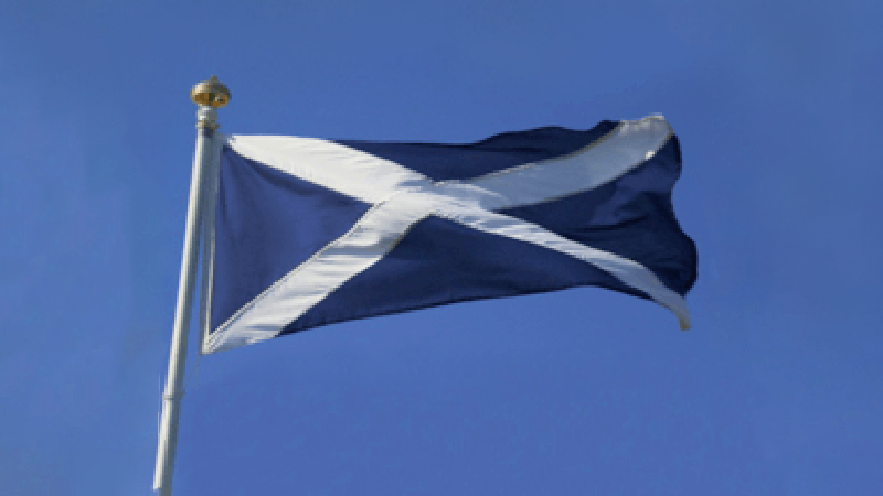
1865: Origins
HSBC was founded by Thomas Sutherland in 1865. Inspiration was taken from the saltire of the Scottish flag, Sutherland’s home country.
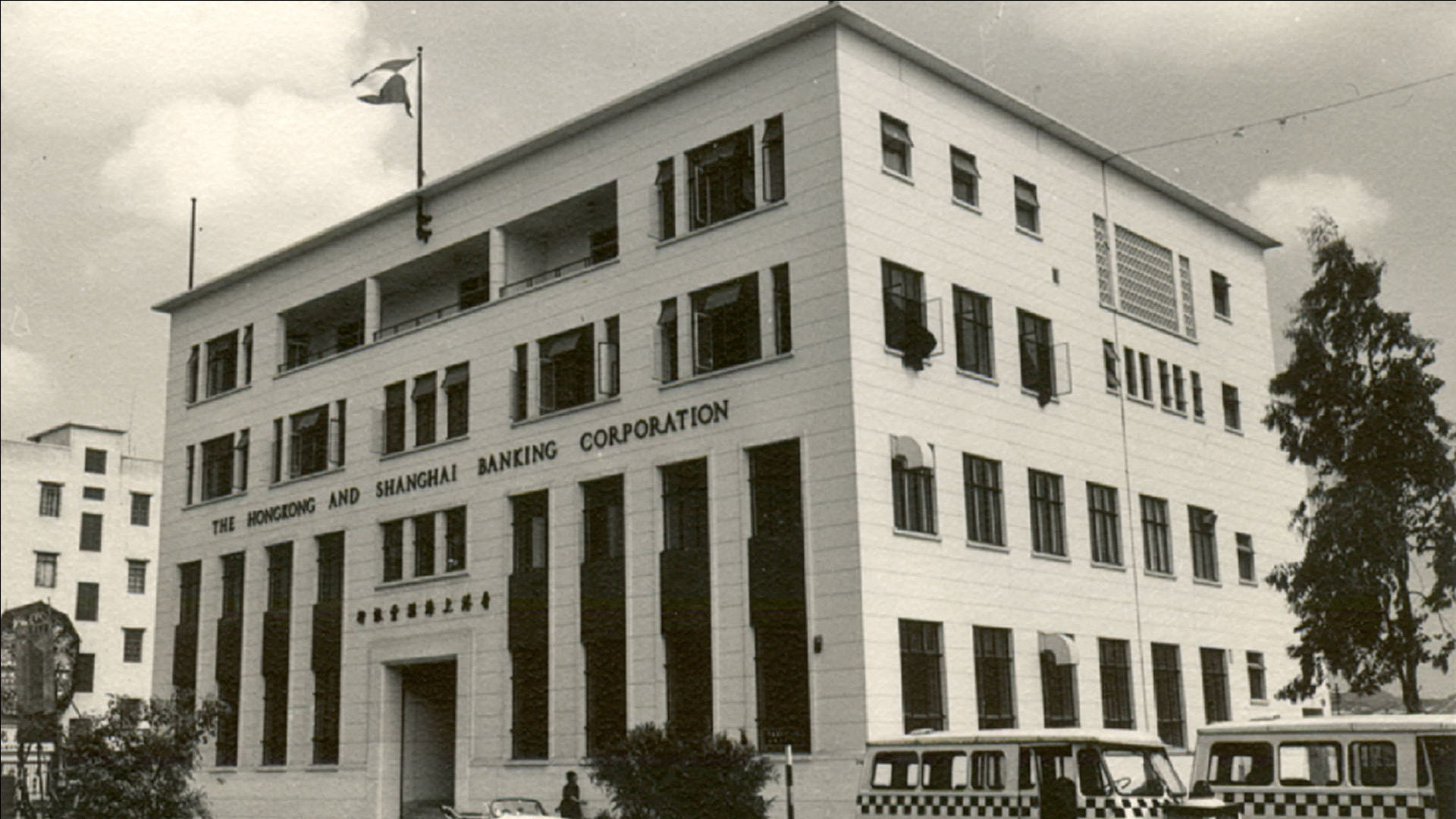
1890s: Company flag
Although the bank didn’t have an official logo, it did fly a house flag outside its buildings. This consisted of four triangles in red and white.
Like most financial institutions of its time, HSBC’s first official logo was its company crest. The design reflected the core mission and purpose of a bank that was founded in Hong Kong, to support trade there.
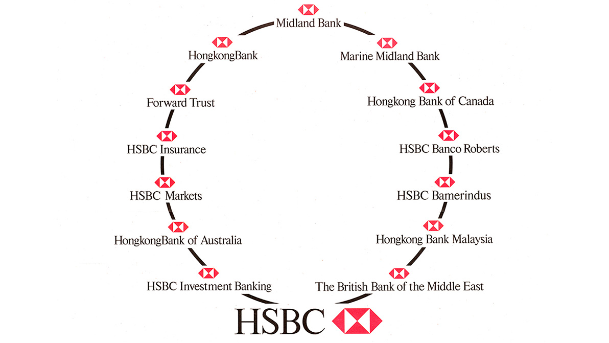
By the mid-twentieth century, HSBC had expanded into a global business, with an active strategy of acquiring businesses in new territories. Each company brought with it its own history, identity and branding.
From at least the 1890s, HSBC had a house flag. The design was a white rectangle divided diagonally to produce a red hourglass shape. HSBC’s founder, Thomas Sutherland, was born in Aberdeen and inspiration for the flag came from the St Andrew’s Cross of the Scottish flag. Many organisations in Hong Kong were founded by Scottish expatriates.
1979: The HSBC Hexagon
In 1979, graphic designer Henry Steiner was engaged to create a corporate identity, to bring a consistent visual identity to all HSBC businesses across the world. The inspiration for chosen logo came from within the bank’s own rich heritage; the original house flag. By adding two red triangles onto the sides of the flag design, the distinctive Hexagon was born.
The Hexagon was introduced to the ‘family’ from 1983 and quickly became a recognisable symbol of the group. HSBC continued its traditional policy of allowing member companies to use their own names.


An interview with Henry Steiner
Henry Steiner recalls the process of designing the HSBC hexagon, during an oral history interview recorded in 2022. He's joined by our archivists, Angharad McCarrick and Florence Lo, as well as his wife, Margaret Au-Yeung, former Graphic Design Manager, Group Public Affairs.
1999: A unified identity
From 1999, all businesses adopted the HSBC name as well as the hexagon logo in their branding. As part of the consolidation process, in 1999 the policy of allowing member companies to use their own names in their own territories ceased.
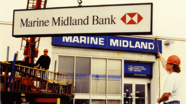
Throughout the year, the rebranding brought together more than 300 subsidiary names under the HSBC name and Hexagon logo. This included long-established institutions such as the British Bank of the Middle East, which became HSBC Middle East, and Marine Midland, which fully adopted the HSBC name.
2018 - 2021: Elevating the hexagon
When logo was redesigned in 2018, the Hexagon moved to sit prominently in front of the bank’s name. In an increasingly digital world, with a wide variety of touchpoints, displaying the HSBC name in bold makes it more readable, whether on a mobile phone, or at the top of a skyscraper.
We simplified the typography to make it more contemporary and fit for multiple screens from stadiums to mobiles.
Today, our Hexagon comes first whenever you meet HSBC – it’s universally used as a front door to the brand.

2021 - present: 'Opening up a world of opportunity'

A lot of great work was produced to express our brand and propositions, but they fragmented our Masterbrand and customer journeys.
Our streamlined, simplified and strengthened core brand and brand promise is more iconic, attractive, consistent and memorable for our audiences, services, and markets.
Explore more
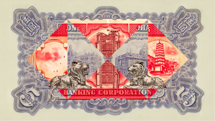
HSBC history website
As one of the most recognisable brands in the world, learn how our past influences our future.

HSBC.com
Explore everything from who we are, to our performance results and strategy.

Accessibility hub
Explore how we're using technology to become the world's most digitally accessible bank.