Just so you know, you’ll need to log on or register to see this content.
Creative Hexagons
How we laid the foundations for using our iconic hexagon in a creative, collaborative way.
More than a logo
The HSBC hexagon is more than just a fixed, cookie-cutter logo. It’s at the heart of all our communications – it follows our customers through their journey with us. It’s there when they see an advert or walk past one of our branches. It’s there when they open up the app. It’s always centre stage, always red, always recognisable. But always with a twist.
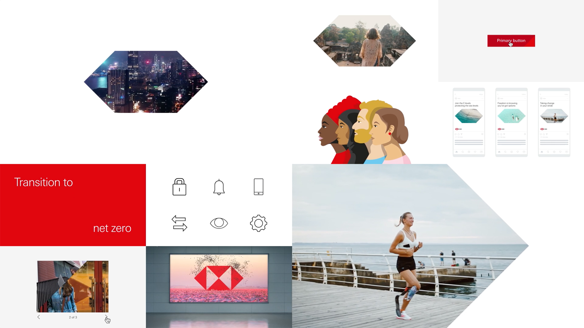
Our single-minded approach to the HSBC hexagon as the anchor for our brand has led us to create three versions that can be used at different points of the customer experience; the Iconic Hexagon; the Open Hexagon and the Cropped Hexagon. These different applications allow us to always put our brand at the forefront in a creative, authentic and consistent way, but also allow the content itself to shine.
The origins of the hexagon
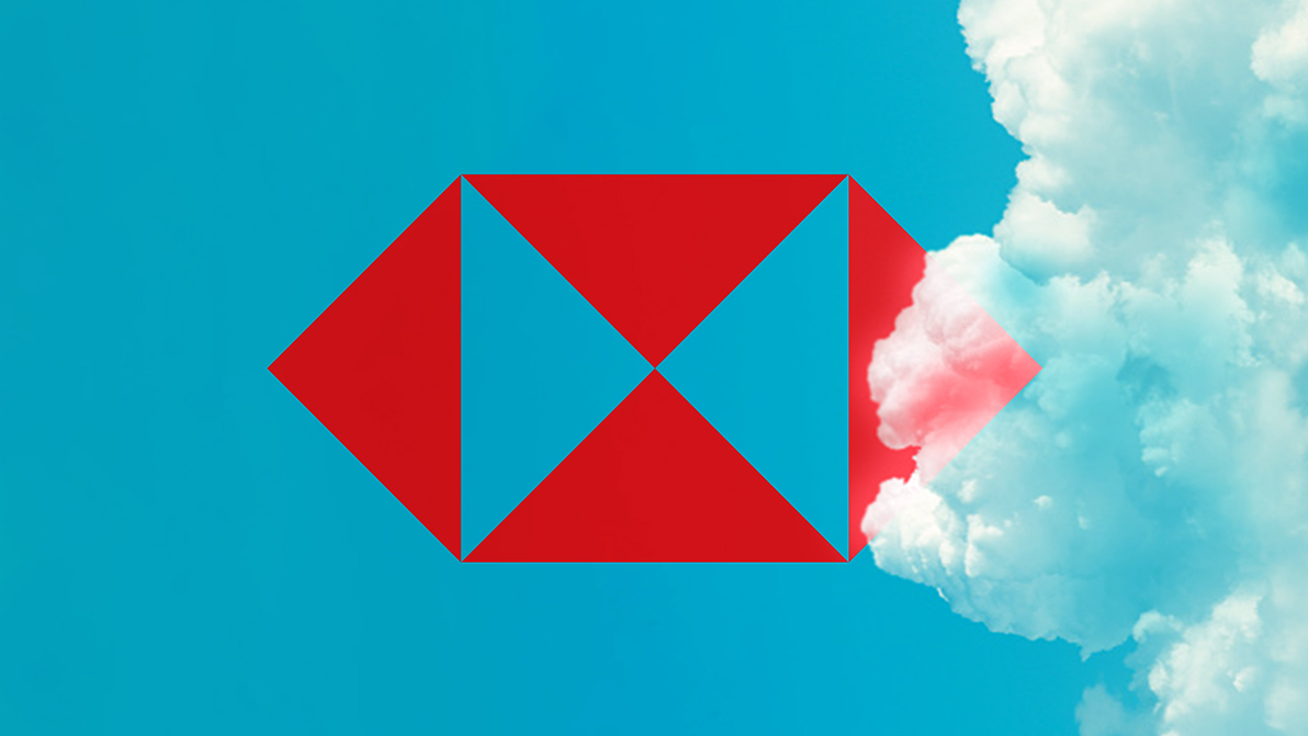
HSBC was founded by Scottish expatriate Thomas Sutherland in 1865. The company didn’t have an official logo at the time, but it did fly a house flag outside its buildings. Composed of four triangles in red and white, inspiration for the design came from the St Andrew’s Cross of the Scottish flag. By the mid-twentieth century, HSBC had expanded into a global company and had acquired many businesses, each with its own history and branding.
It wasn’t until 1979, when graphic designer Henry Steiner was asked to create a consistent visual identity for the business, that HSBC’s iconic hexagon was born. For inspiration, he looked to the brand’s rich heritage and its house flag, simply adding two red triangles on the side of the flag. This dynamic and instantly recognisable symbol brings to life HSBC’s purpose as a global connector with a far-reaching outlook. And it’s been at the heart of our brand ever since.
Creativity and consistency
Like many big businesses, we have hundreds of teams working on different design aspects across our network at any one time, so making sure we’re all working towards the same goals is vital.
Our Brand team has gone from gatekeepers to enablers of creative discussions and builders of a global community that can all work harmoniously together. Part of its job is to give the right guidance, tools and assets; so we can harness the power of the creative minds across the group. You can see how it’s working in the way our hexagons have flourished.
Thanks to our Create Design System, there’s a lot of opportunity for coming up with really interesting design ideas when it comes to hexagons. But at the same time, there’s a framework and a logic behind them; a fix-and-flex system that gives us enough freedom to investigate different creative routes and tailor ideas to the nuance of our different markets and audiences.
It means that no matter which team is producing a hexagon, they’ll come up with something that feels aligned to the rest of the brand.
The Iconic Hexagon
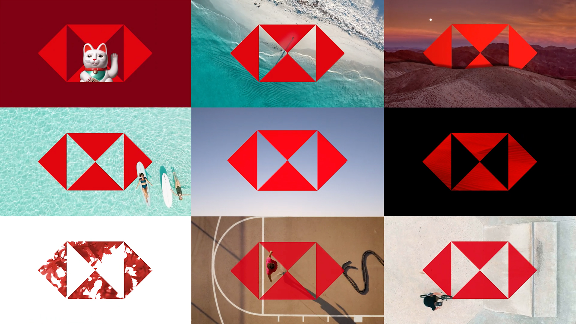
The Iconic Hexagon is used to create meaningful and relevant communications throughout the customer journey and across all brand platforms.
It’s our definitive visual cue through which we connect our brand to what’s important in our customers’ lives, and in so doing build on and strengthen our relationship with them.
As the Iconic Hexagon is the asset that’s closest to the HSBC logo, it’s particularly effective when used at the first point of contact with our customers. We use our Iconic Hexagon to say a variety of things in a host of different ways; it can be thought provoking, visually intriguing, playful, or witty. It leads the way in everything we create, to the point that everyone knows HSBC is the red hexagon and the red hexagon is HSBC.
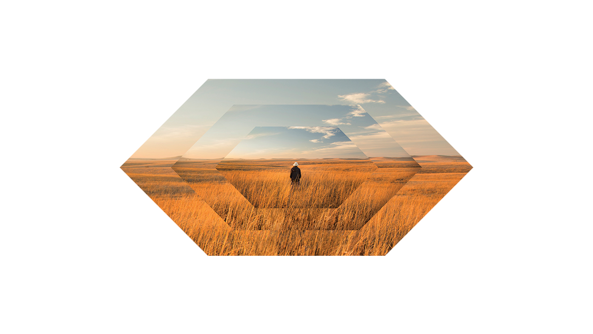
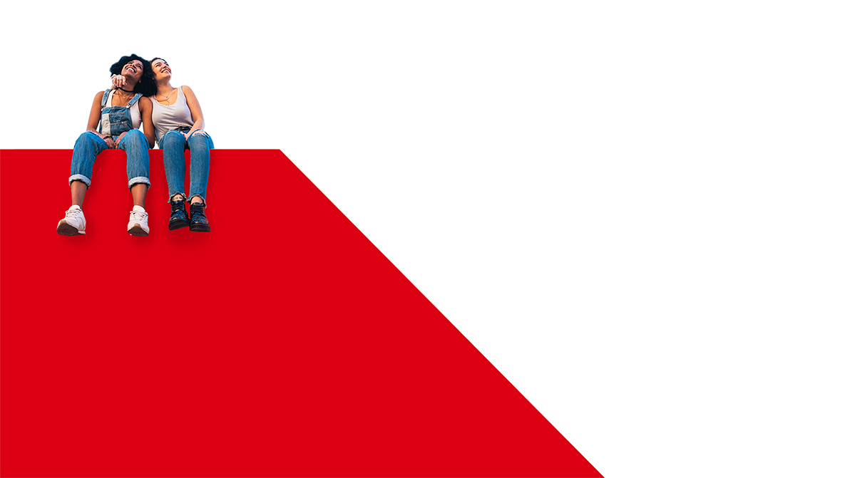
The Open and Cropped Hexagons
As our customers get to know us as a brand a bit better, we open up a bit more – literally. That’s where the Open and Cropped Hexagons come in. The Open and Cropped Hexagons act like a platform for the products and services, messaging or even the people we want to talk to and about. There’s still a subtle, but recognisable use of the hexagon shape. But our intention is to provide a window into customers’ and colleagues' lives that they can reflect and engage with.
The Open Hexagon is a larger canvas, a lens on the wider world which allows us to focus on the finer details in life.
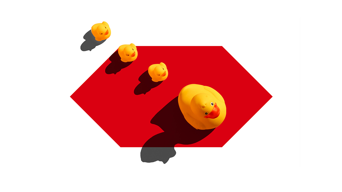
The Cropped Hexagon is another articulation of our logo that gives us bold canvasses to work with – we use the angles of the Hexagon to create eye-catching and distinctive shapes. It’s a far subtler use of our hexagon and is used to gently guide our customer through our services and products.

Explore more
HSBC in motion
The development of our motion system and the role it plays in strengthening our brand identity.
Brand identity
Strengthened, streamlined and simplified; our refreshed brand identity sets us up for success.

Create Design System
A design community working together to deliver connected products and experiences.