Just so you know, you’ll need to log on or register to see this content.
Brand recognition vs customisation within app tiles
How to retain app tile brand recognition when a user can change between light, dark and tinted modes.
Introduction
App tiles (icons) are much more than tiny, colourful squares on your device's screen. These are the digital faces of our brand, serving as visual touch-points that connect users with your services. Ensuring that these app tiles are consistent with our brand is not just about aesthetics—it's about reinforcing our brand identity and driving engagement while retaining user preferences and maintaining accessibility standards.
Two highly anticipated features - dark mode and tinted mode – have been added to the default light mode by Apple in its latest iOS update. These new display options offer users greater flexibility in how they interact with their devices, providing a more personalised and comfortable experience.
- Light mode features a bright, traditional interface with dark text on a light background, ideal for use in well-lit environments.
- Dark mode inverts this scheme, offering a dark background with light text, which reduces eye strain in low-light settings and saves battery life.
- Tinted mode adds a layer of personalisation, allowing users to apply a subtle colour overlay across the interface, catering to specific visual preferences or enhancing accessibility.
Apple’s system uses algorithms to automatically adjust existing app tiles for dark and tinted mode. Alternatively you can manually upload a versions of the app tile for each mode.
Problems with the automatically adjusted app tiles
Automatically adjusted app tiles don't match our brand standards. For two-colour app tiles it appears that the colours have been reversed and the background removed by iOS. For tiles with more than two colours, the design remains unchanged.
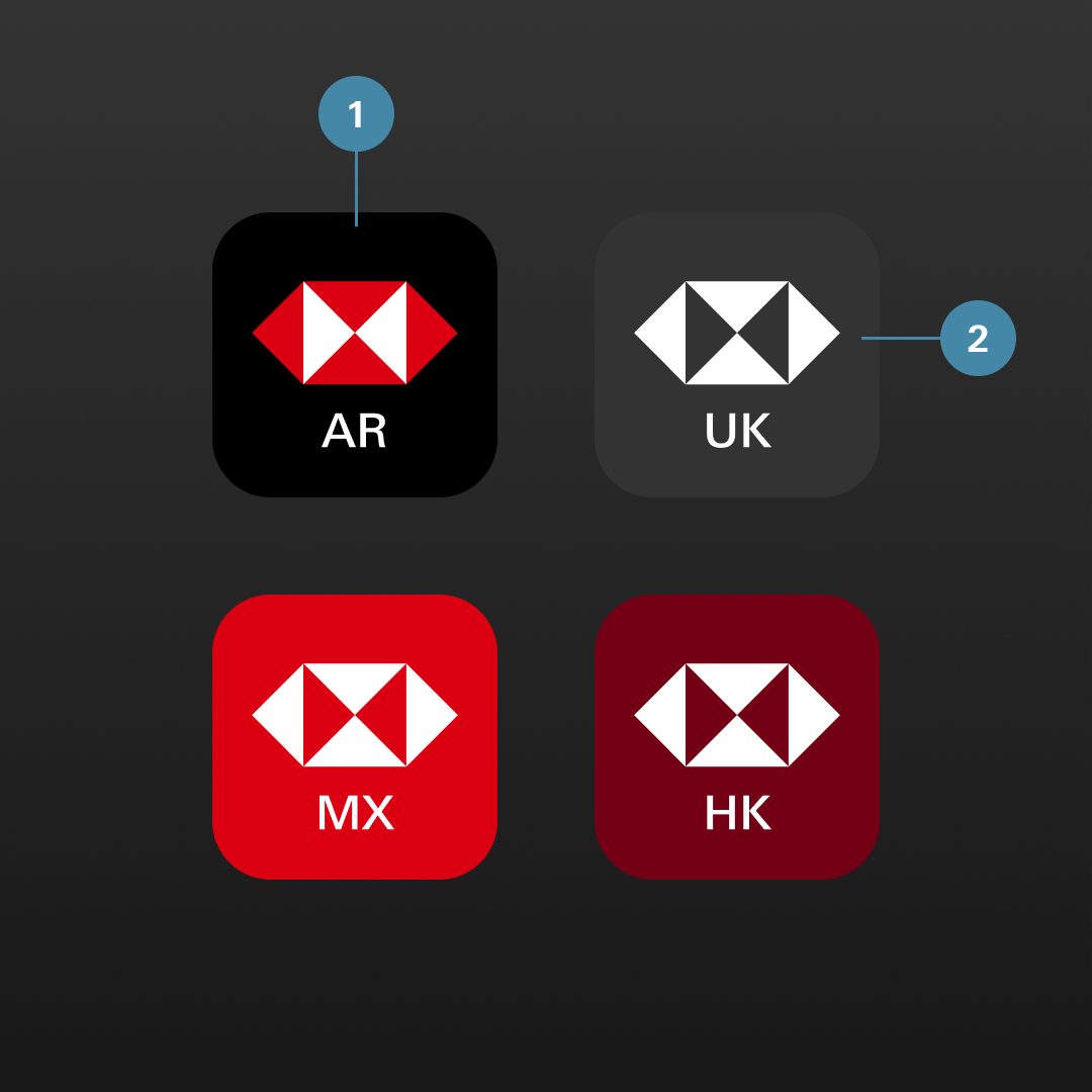
Automatically adjusted app tiles in different modes

Light mode

Dark mode

Tinted mode
Issues with the current app tile designs:
- Brand perception is compromised in dark mode.
- The iconic hexagon is not displayed correctly in our core colours.
- There's not enough colour contrast in tinted mode.
Why design separate versions for all three modes?
By offering the ability to switch between light, dark, and tinted mode while staying consistent with our brand standards empowers users to tailor the digital environment according to their requirements, leading to a more comfortable and enjoyable experience.

Light mode
Dark mode

Tinted mode
Improved designs for the app tile:
- Brand perception is enhanced in dark mode.
- The iconic hexagon is displayed exclusively in our core colours.
- There’s sufficient colour contrast in tinted mode.
Apple iOS allows us to upload a separate app tile design for each mode.
Explore more

Brand identity
Strengthened, streamlined and simplified; our refreshed brand identity sets us up for success.

Create Design System
A design community working together to deliver connected products and experiences.

Accessible by design
Learn about HSBC’s approach to digital accessibility and what it means to us.