Just so you know, you’ll need to log on or register to see this content.
Diversity and inclusion
Connecting people, ideas and capital with our borderless approach to banking.
As a bank, we’re all about the people we serve. They’re at the heart of our business, at the forefront of our minds every decision we make. Our purpose is to connect them with ideas and opportunities across borders, continents and cultures. And we carry that through into how we communicate by being inclusive in our language and choice of imagery.
We never forget our customers are real people with diverse beliefs, feelings and identities. So, no matter who or where they are, we talk to them in a way that makes them feel seen and respected. We feel this should be the norm, and we hope to lead by example and encourage other organisations to adopt similar practices.
Here’s how we make sure that comes across.
We don’t define our audience too narrowly
We always write with an audience in mind. This helps focus our message and stay relevant to the people we want to reach. But we don’t want to define our target audience so narrowly that we exclude other important facets of who they are.
For example, our reader could be a business owner in their mid-thirties. But they may choose to define themselves in other ways, too; by race, nationality, sexual orientation, gender identity, whether they’re a parent, if they’re neurodiverse, if they have a disability, or whether English is their first language.
By being aware of the reader’s overlapping identities and affiliations, we’re less likely to make assumptions that make them feel overlooked or excluded. We take the time to consider what else might be important to our target audience, before we start writing.

We pay attention to gendered or binary language
Consciously using gender-neutral language helps us speak to everyone, no matter how they personally identify. For example, we address our customers by name rather than using gendered titles (Mr, Mrs, Miss, Ms); we use the gender-neutral pronouns they / them unless told otherwise; we avoid assigning a default gender to certain social groups (such as ‘mothers’ and ‘fathers’ when we could say ‘parents’ or ‘caregivers’), and we avoid gendered distinctions for professional roles (chairman, policeman etc).

We don’t only write for the majority
With everything we write, we ask ourselves if there’s an opportunity to open it up to a group that isn’t usually catered for or considered. One way we do this is to consciously interrogate and evaluate our word choices when editing. This means watching out for coded language – language that seems harmless but is rooted in historical prejudice or negative social perceptions. We aim to avoid umbrella terms and catch-all phrases that group different communities, so we don’t exclude or generalise people. And we follow Associated Press style, capitalising proper nouns related to race, nationality, culture and faith.
We think about names and cultural references
There might be instances where we need to show our reader what to do by giving them an example to follow. In an online form, we might need to pre-populate a field with an example name to show a user where their name should go. In a brochure about retirement funds, we might reference ways people choose to spend their leisure time. Or we might be writing a guide script for a new chatbot. Whatever the purpose, we try and be as inclusive as possible, varying names to reflect a range of cultures, backgrounds and faiths, including lifestyle examples relevant to different social groups, and mixing up cultural references so they don’t only reflect the experiences of the majority. Being thoughtful about small details like these can make a big difference to our reader.

We take a people-first approach to differences
Disabilities, mental health conditions or personal circumstances mean that some of us experience life differently to others. By using language in the right way, we show awareness of these differences without being disrespectful. We always put the person before their diagnosis, disability or difference. For example, instead of saying ‘homeless person’, we say ‘a person who is experiencing homelessness’. And instead of ‘disabled person’, we say ‘person with a disability’.
The way we talk about certain medical conditions, such as mental health, can also contribute to negative stereotypes. So, we always describe the condition, rather than using it to define someone, or saying that they ‘suffer from’ it. Rather than ‘Jing is an epileptic’, we say ‘Jing has epilepsy’.
Some people might choose to define themselves by their difference. People with autism often say ‘I’m autistic’ as it’s part of their identity. Similarly, many people in the deaf community define themselves as such. If there’s ever any doubt, we use person-first language to stay respectful.
We’re conscious of how language can feed everyday discrimination, such as ageism or homophobia. For example, referring to someone as 'old' or as 'elderly' suggests that they’re weak or inferior. Whereas a phrase like 'a reader who is over 65' acknowledges their age without presenting the person negatively.
Visual diversity and inclusivity
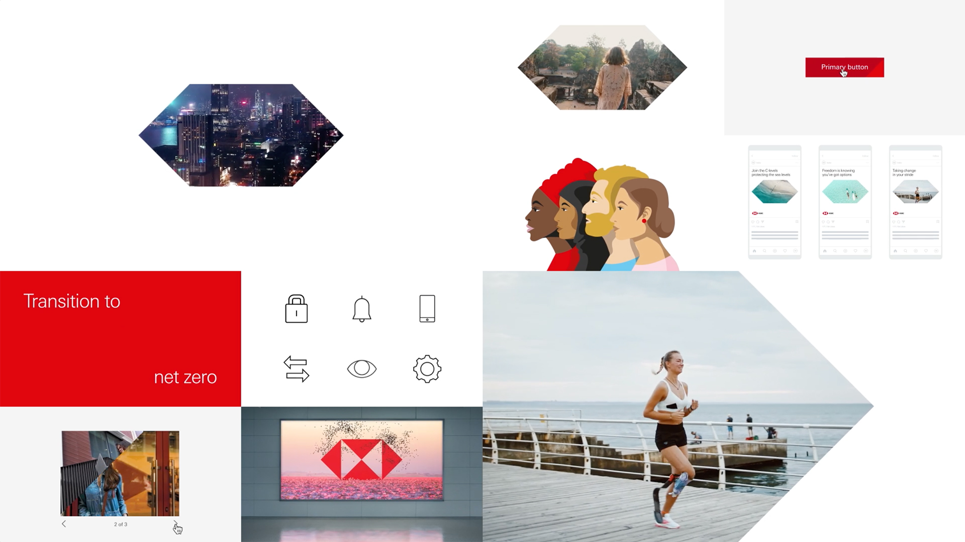
Of course, diversity and inclusivity goes beyond words; it’s reflected in every image we use, every design choice we make. Seeing diversity is increasingly important for our audiences.
When we source stock photography, it’s crucial that we choose imagery that’s inclusive and representative of our audience’s diversity. Here’s what we look for when selecting photography:
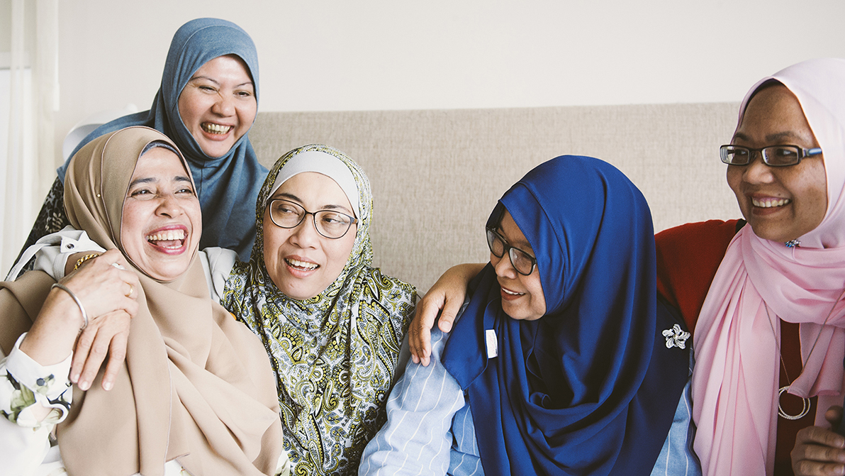
1. Represent diversity through more than just skin colour or appearance
We select images that capture people’s lifestyles and cultures. This shows a far greater understanding of, and empathy with, our audience.
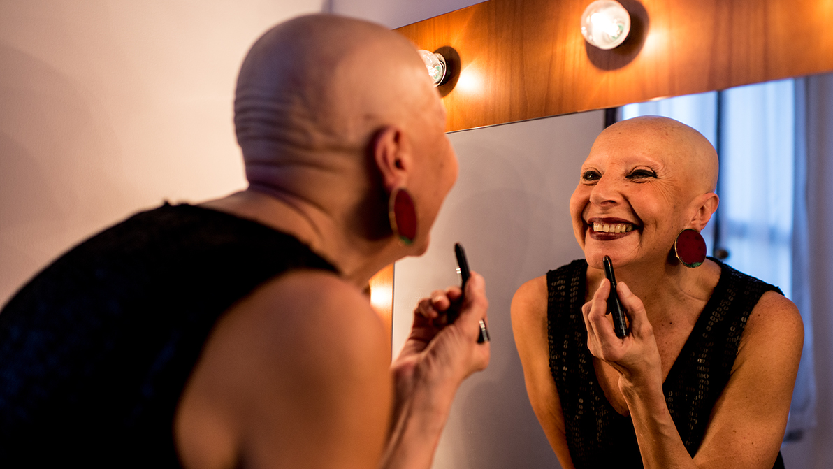
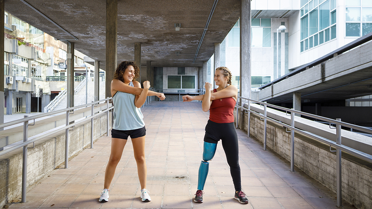
2. Show a variety of body images and types
8 in 10 consumers want brands to show all body shapes and types in their communications.

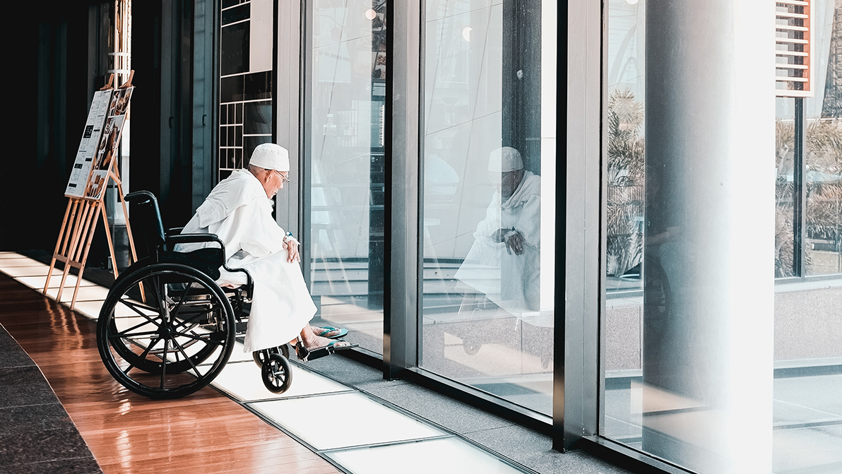
3. Avoid age discrimination
People over 50 are often thought of as ‘old’. We aim to challenge this by showing older individuals enjoying intrepid, rich or unexpected experiences in our communications.

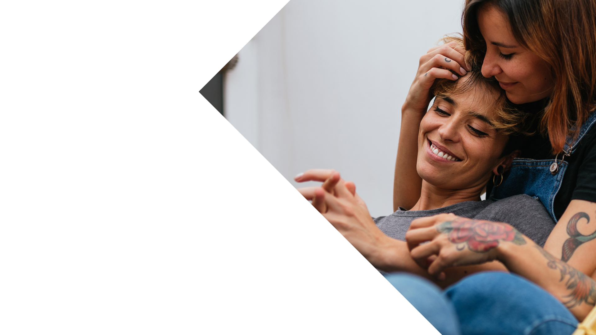
4. Look for 'realness'
All people are drawn to human connection – it’s how we’re programmed. We seek out images that show unique personalities; real people in real life, connecting with real emotion.

5. Avoid tokenism
Tokenism is 'when the inclusion of a minority or other underrepresented group is no more than a symbolic effort to make a story or environment seem equal or diverse'. For example, if in a stock image most people look the same, but there is just one person from a marginalised ethnic group, or just one person with a disability, that can be perceived as tokenism.
Tokenism can come across as inauthentic – especially to the people you’re trying to represent.
6. Consider the power dynamics depicted in an image
Where possible, we remove hierarchies from an image. We strive for a balance between showing them as positive, leading characters and supporting, passive characters across a range of images. When they’re shown to be the main character, we make sure they’re in the foreground and have an active role.

7. Include alt text
The alt text attribute always needs to be present. However, if the image is purely decorative, or any alternative text would just repeat copy that is already on the page, then it should be given a null alt text value, i.e., alt="". Alt text should convey the meaning of the image, rather than trying to describe the image itself.
When we use alt text, we keep it short and simple – only including the information people need to know.
Good alt text should:
- convey the meaning or content that is displayed visually
- describe the contents of the image if that’s useful and informative
- be short, meaningful and specific
- feature standard punctuation like commas and full stops
- avoid using 'image of,' 'picture of,' or something similar
- avoid using emojis
If in doubt, we read the alt text out loud to check. This is what people using screen readers will experience.

Examples that bring our diversity and inclusivity standards to life
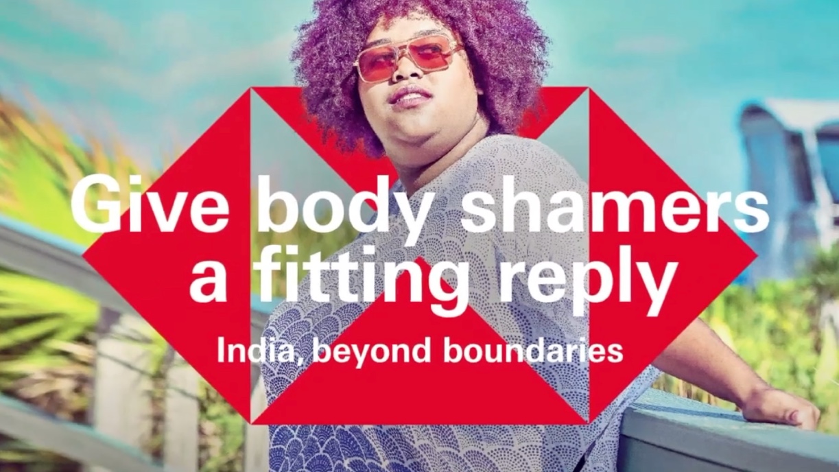
India, beyond boundaries
We used inclusive imagery from a stock photo library to bring to life our brand’s point of view – that people thrive more when they’re not held back by the invisible boundaries that society puts in front of them.
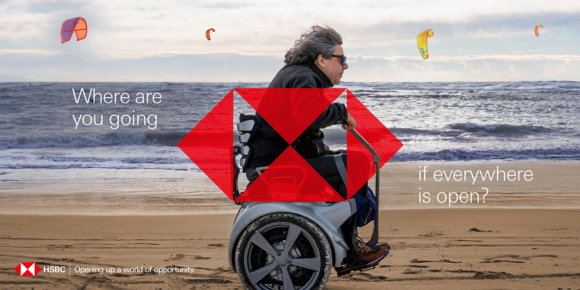
Global Airports Campaign, 2022
This campaign inspired people to ask bigger, bolder and more ambitious questions.
Research showed that this campaign shifted the perception of HSBC to a bank that is ‘playful’ and ‘human’, qualities rarely associated with the banking category. Consumers naturally linked this idea of openness with our products and services, so we made our purpose and values as a bank clear.
Want to learn more? Explore our Accessibility Hub.
Explore more

Creative Hexagons
How we laid the foundations for using our Iconic Hexagon in a creative, collaborative way.
The Hexes: A celebration of creativity
Celebrating the best in creativity, innovation and ambition in HSBC.
HSBC in motion
The development of our motion system and the role it plays in strengthening our brand identity.