Welcome to create.hsbc
Just so you know, you’ll need to log on or register to see this content.
The art of simplicity
How UX designer and illustrator, Kate Evans, created the suite of illustrations for HSBC's Brand Strategy Toolkit.
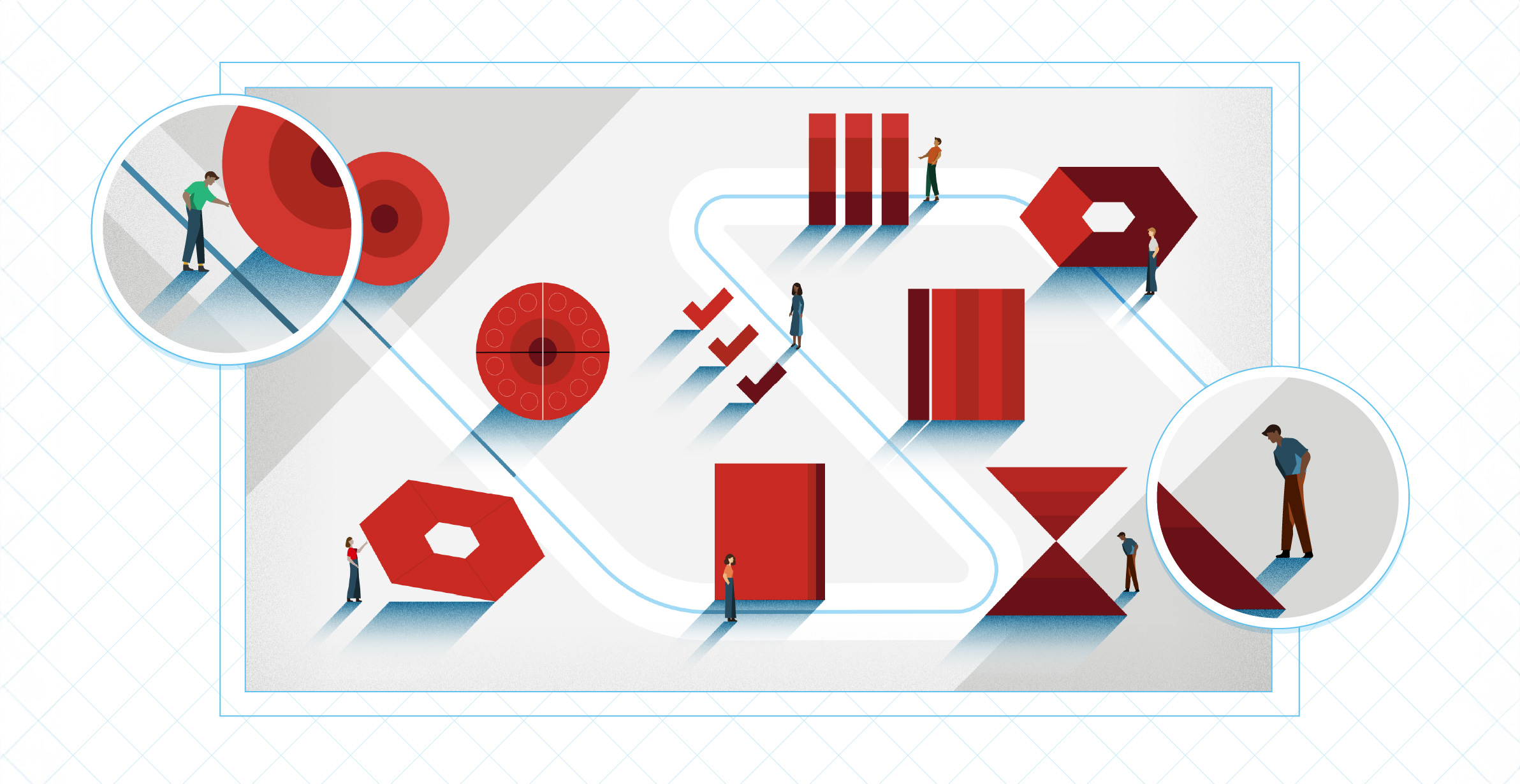
The HSBC Brand Strategy Toolkit’s suite of illustrations was created by UX designer and illustrator, Kate Evans. Here, she shares her methods of working, how illustration plays a role in her work as a designer, and why simplifying icons and diagrams is a bigger challenge than it sounds.
To translate the document’s information into the most simple icons and diagrams, it took lots of conversations and asking lots of seemingly obvious questions… in order to get to the level of understanding needed before being able to simplify.
UX designer and illustrator
Where did you learn the craft of illustration?
I wanted to be an artist for many years and I decided to go into illustration because it's practical. I studied illustration for three years at Falmouth University in Cornwall. When I left, I got a job as an illustrator for a tech company, making and improving their illustration library, before soon moving into UX and UI design there.
How does illustration usually play a role in your work as a designer?
A lot, I would say – in a few different ways. I do lots of work evolving brands to suit web design and UI design system applications. And, as part of that, I often suggest illustration styles, because illustration is so useful as part of a design system – illustration can represent many things that photography can't or struggles to. With illustrations, you can represent concepts much more easily and you can play with the level of how literal something is.
Illustration is also proven to improve a product’s user experience when done correctly. I've worked for agencies where, as a UX designer, you do usability testing to see how gradual changes to the UI can affect user experience. For example, with an app that's struggling to elicit trust with users, adding illustrations to that experience has been proven to help users understand their experience as well as improving the look and feel by becoming more friendly and personable.
There’s also something about being an illustrator that, I think, changes the way I approach UI design in general. Ultimately, user interfaces and illustrations are both ways of communicating a message through visual metaphor. It's just that usually, UI is a much more simplified and interactive way of doing so.
Why did you choose to design a hero illustration on the cover, rather than typography?
We initially had a placeholder image for the main cover, but it just really didn't go with the style of the brand tools. It made sense to continue the illustrative style for the cover.
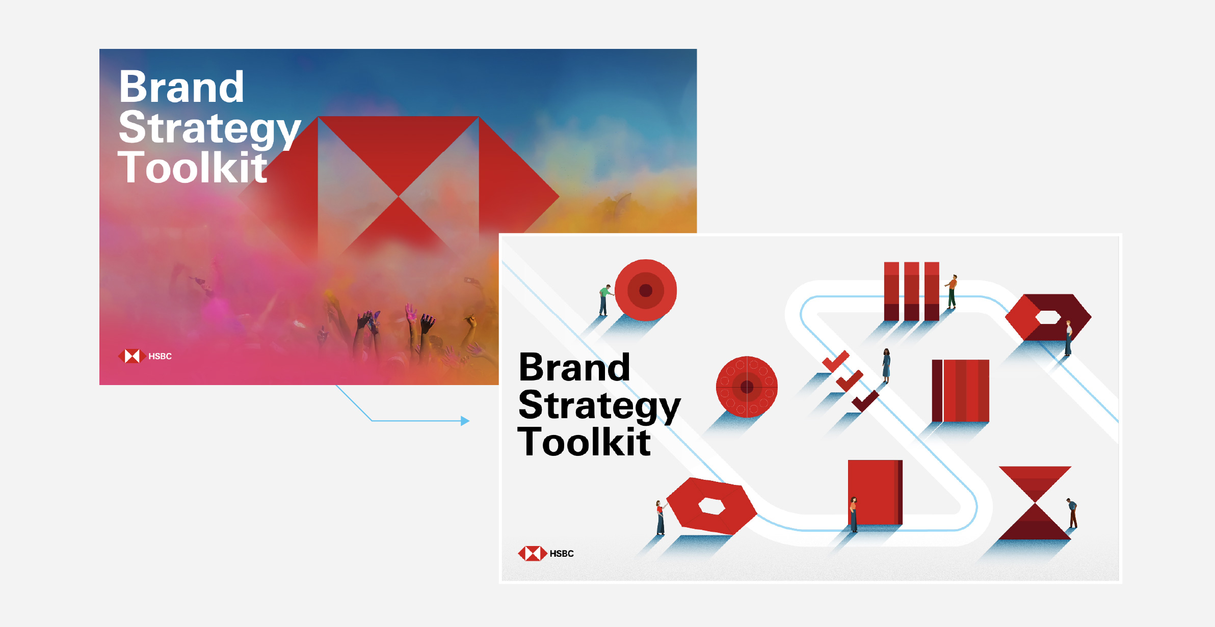
I needed to figure out how to match the style going through, and the kind of themes and just bring that into the main image. To me, the simplest thing would be to have a collection of all the brand tool icons on the front cover, but that just itself seemed a bit too boring.
What was your process of working to create it?
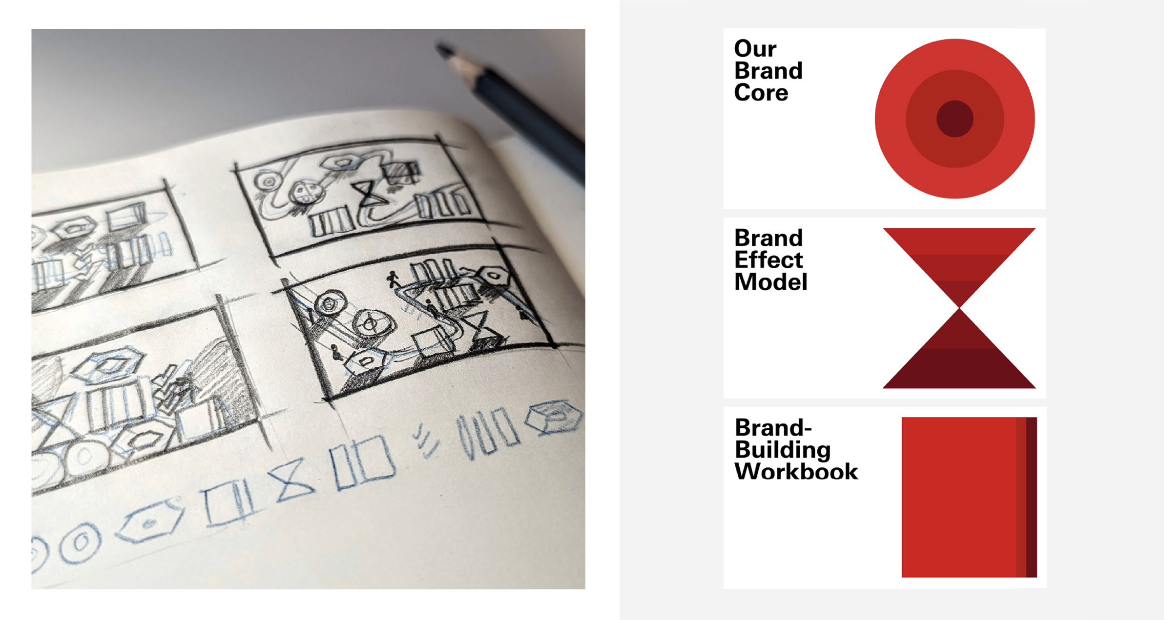
Initially, I collated a board of illustration inspirations and, within it, there was an example that used a map. That was the seed for my idea and probably the most influential to the design.
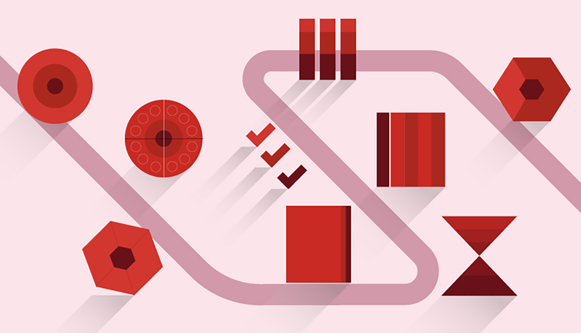
A map-style layout seemed the most appropriate thing to summarise the brand tools. For people using the tools, it would be a path or a journey in understanding each tool and how to action it, as well as their own part in the brand. It made sense to bring that metaphor to life, and show HSBC team members literally navigating the brand tools and progressing along a pathway.
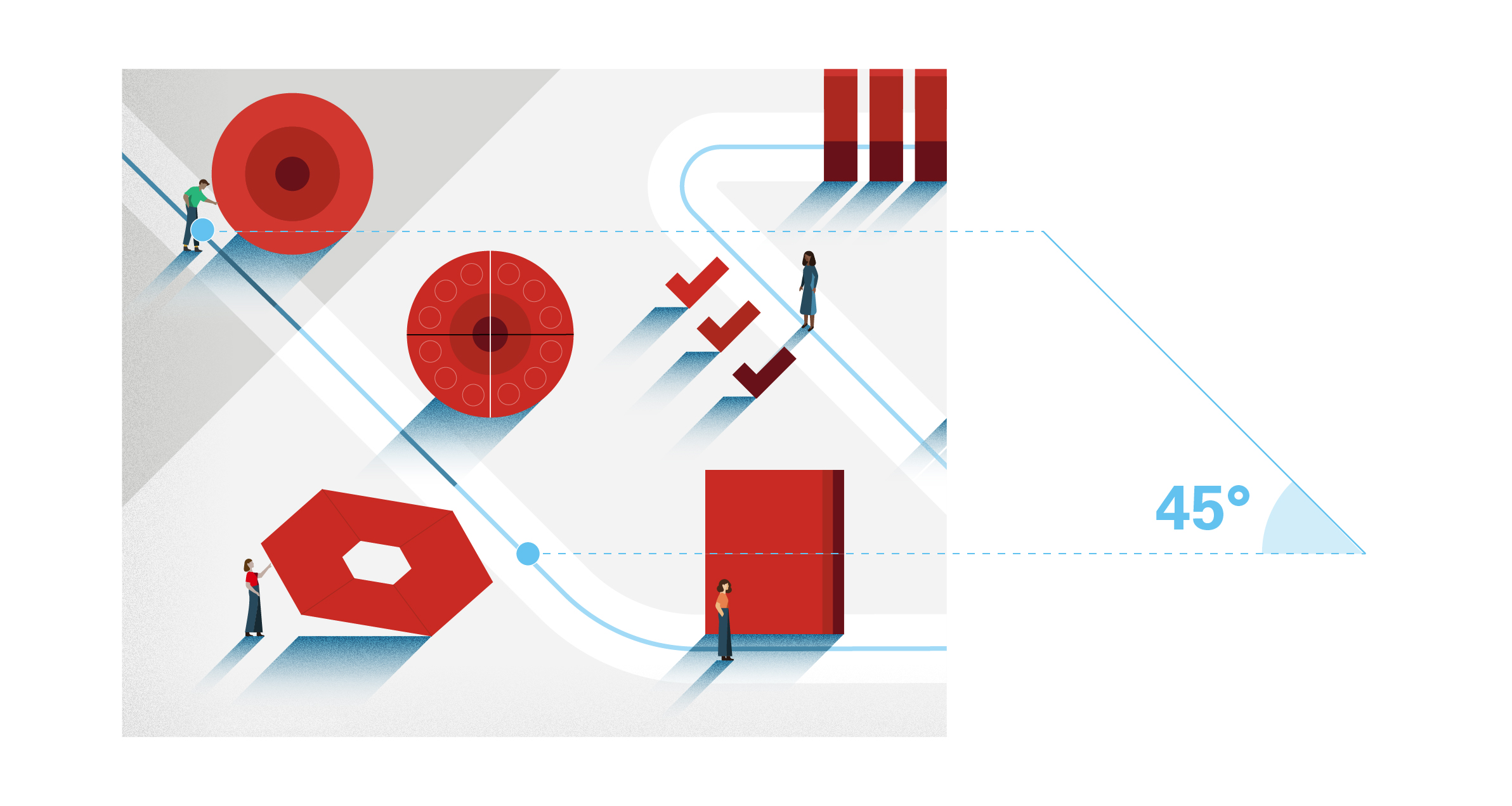
I examined lots of example illustrations provided within Create – HSBC's design system – showing use of 45-degree angles, levels of detail needed, styles for human figures, etc. I sketched out some ideas and suddenly I had a really simple, almost isometric landscape and road that used 45-degree angles.
I laid it out on a page digitally, to play around with the assets themselves and see how everything could fit. I created a semi-isometric grid to place the icons on top in a visually appealing and balanced way – putting them on a plane of existence, rather than sort of floating around in the air.
Then it was a question of how much detail do I add? And how much whitespace do I leave? That's when I started adding the tiny people. I copied the style of people on the illustration guide in Create – which thankfully, is quite simple – I just customised them slightly.
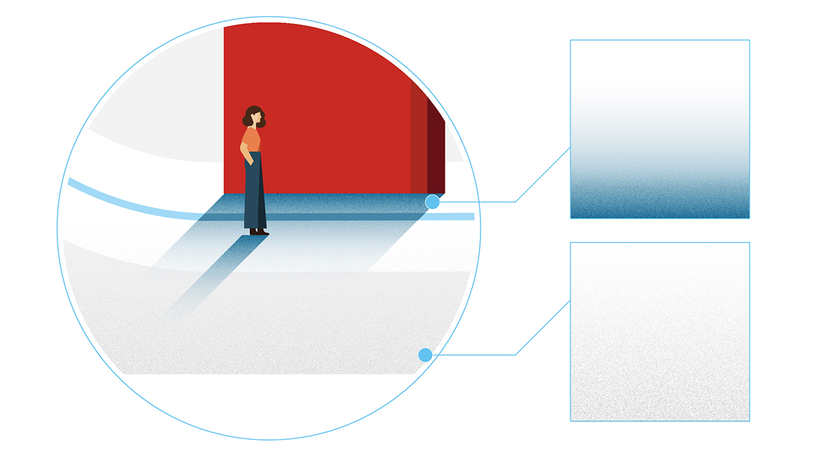
Lastly, I followed the Create guidelines by adding 45-degree shadows for a sense of drama, plus a little bit of texture to make the illustration more interesting to look at.
How did you make sure the hero illustrations portrayed HSBC's brand personality of warmth and intelligent with, yet stayed within our guidelines for visual consistency?
For warmth, I played around with the colours to get the balance right, while staying on brand. My original Illustrator file, for example, had a pink version as well, where the background is pink and all the shadows are pink. And I also have one where the background is a light blue, but both felt too much. In the end I went with a mostly red and grey limited colour palette to match the brand tools themselves, which sounds quite cold, but I was able to ‘warm it up’ by including hints of blues in the details and in the shadows.
For wit, I thought the fun could come from making the people in the illustration extra small compared to the giant, monolithic ‘icons’ placed around their path. One woman can lift one of them up, which seems like it would be impossible, and someone else is staring up at the pillars appearing shocked at their height. But probably because the people are quite small, I was able to get the balance right, so it didn’t seem overly playful.


Where did you look for inspiration and ideas?
While creating the shapes for the suite of illustrations that represent each brand tool, I had some of the Bauhaus art and design principles in mind – 'less is more', simple and striking space, and bold colours.
Tell us about one challenge you faced
To translate the document’s information into the simplest icons and diagrams, it took lots of conversations and asking lots of seemingly obvious questions – simplifying something is harder than it might sound, so I had to be quite vulnerable with my questions in order to get to the level of understanding needed before being able to simplify it. If there was more time, there might have been more ways I could have simplified things even further and created more or improved ways of illustrating some of those concepts.
This article has been supplied by individuals who are part of our create.hsbc community. Any personal thoughts or opinions contained in the article do not represent an official view of HSBC and isn’t endorsed by HSBC. This article isn’t intended to provide professional advice. Readers should seek appropriate professional advice where necessary before taking any action based on the information contained in this article.
Explore more
Brand identity
Strengthened, streamlined and simplified; our refreshed brand identity sets us up for success.

Accessible by design
Learn about HSBC’s approach to digital accessibility and what it means to us.

Diversity and inclusion
Connecting people, ideas and capital with our borderless approach to banking.
